
Motique® Identity Design & Visual Assets
I’ve spent the last 16 years as the sole designer for a multi-property hospitality company, with select freelance work mixed in. The range spans brand, print, digital, video, email, signage, and web.

Motique® Identity Design & Visual Assets

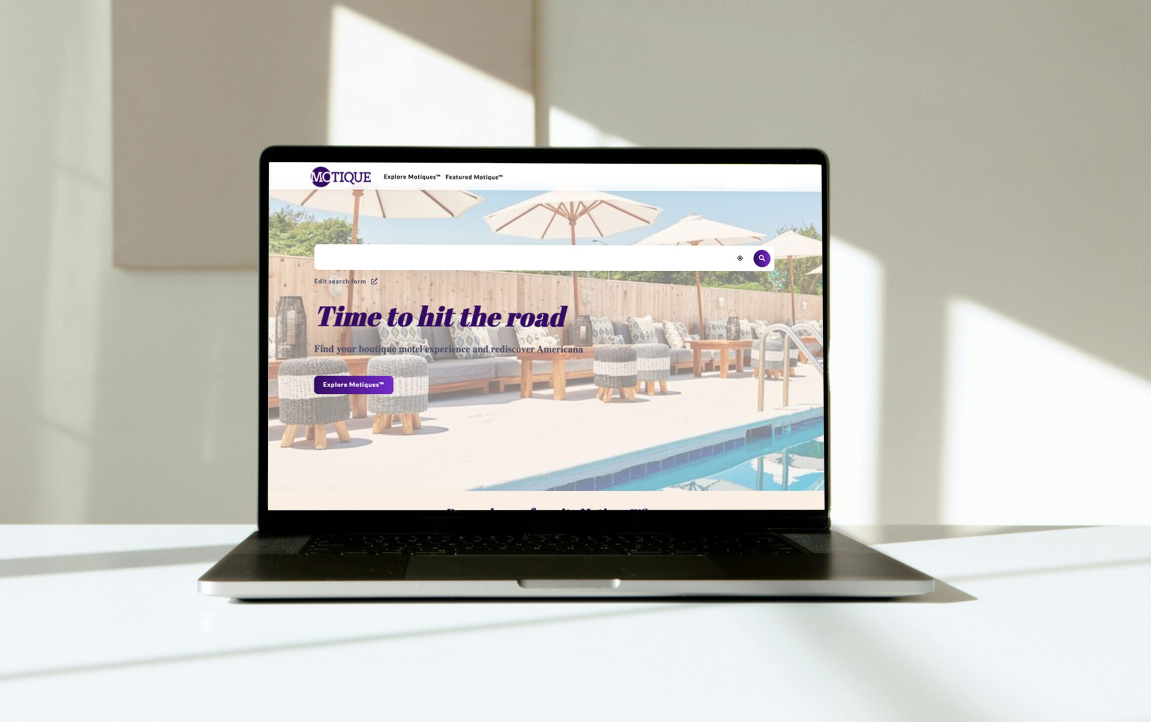
Motique® | Website Design & Layout

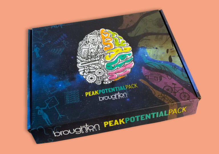
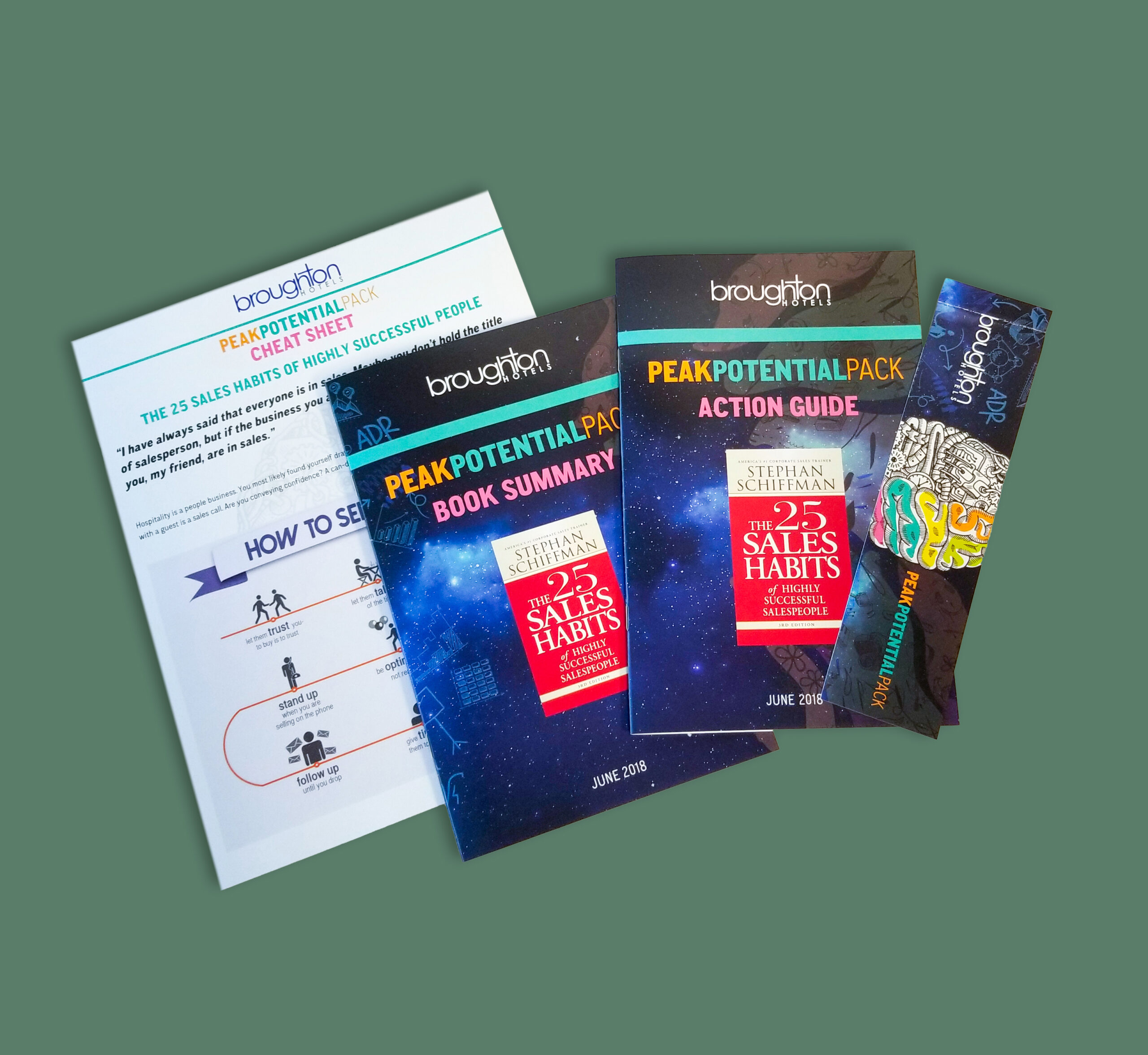
broughtonHOTELS | Packaging & Brand Collateral System

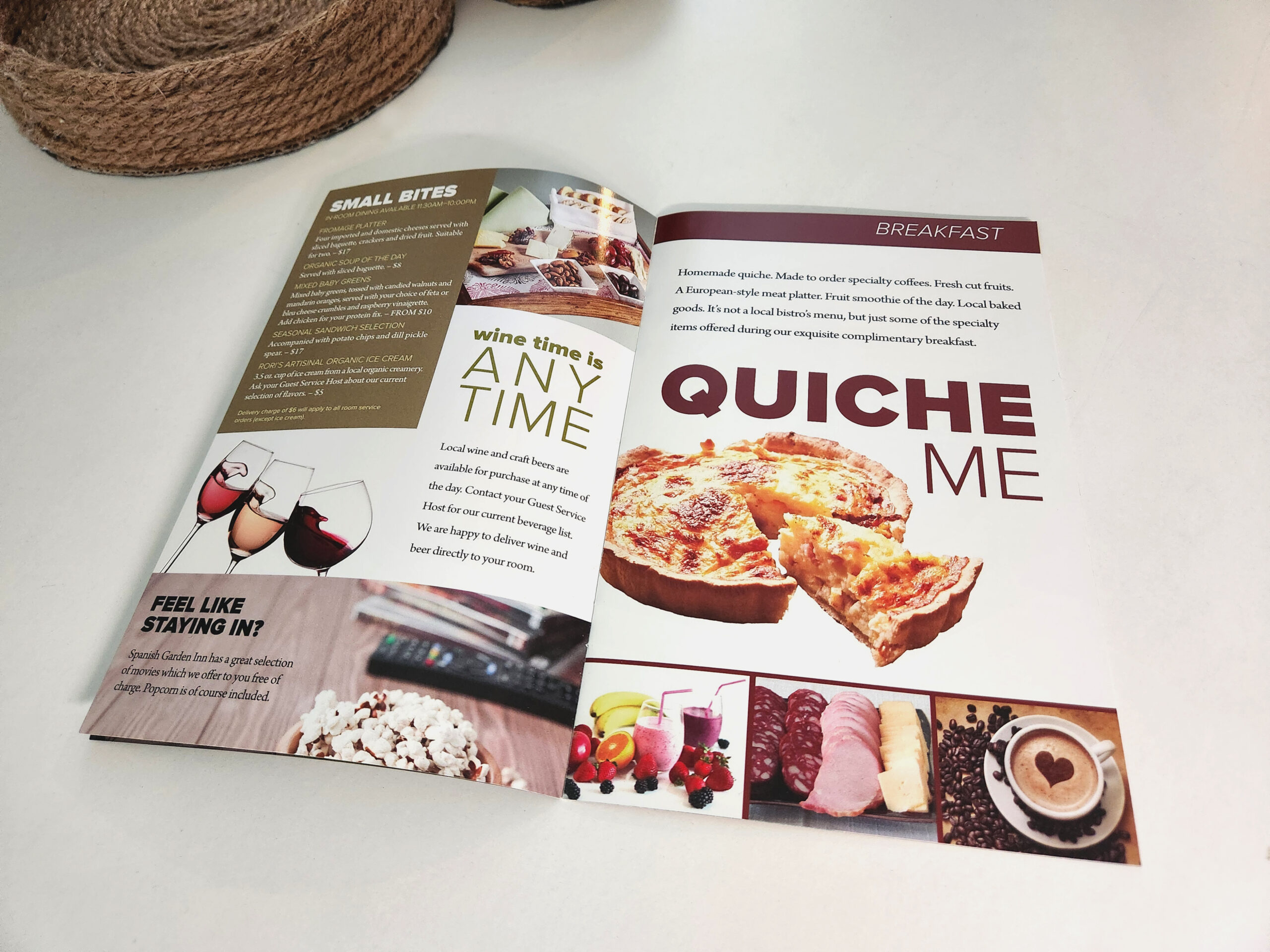
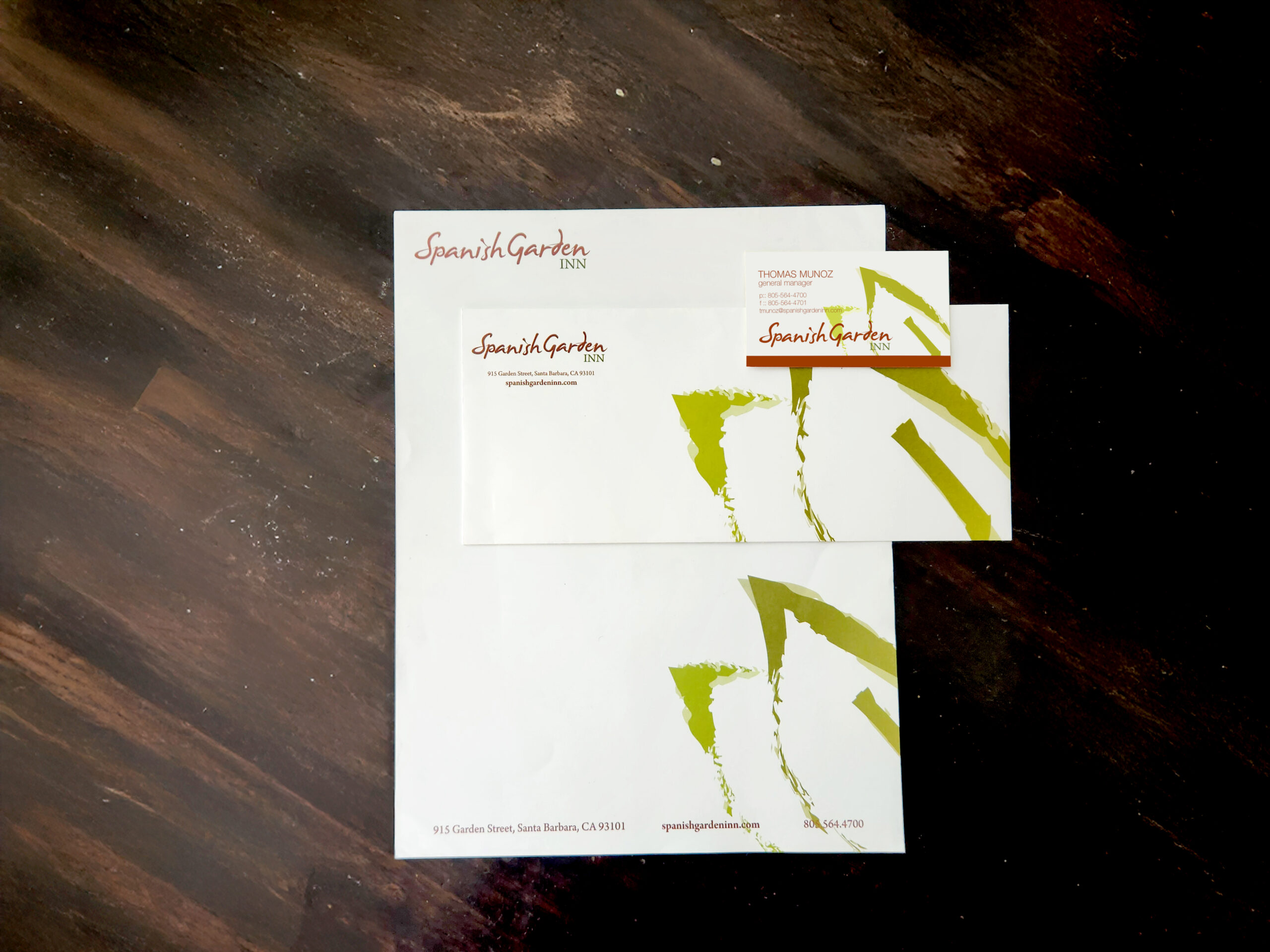
Spanish Garden Inn | Editorial Design & Brand Collateral

broughtonBUCKS Internal Rewards Program

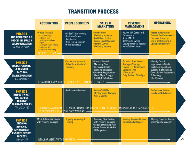
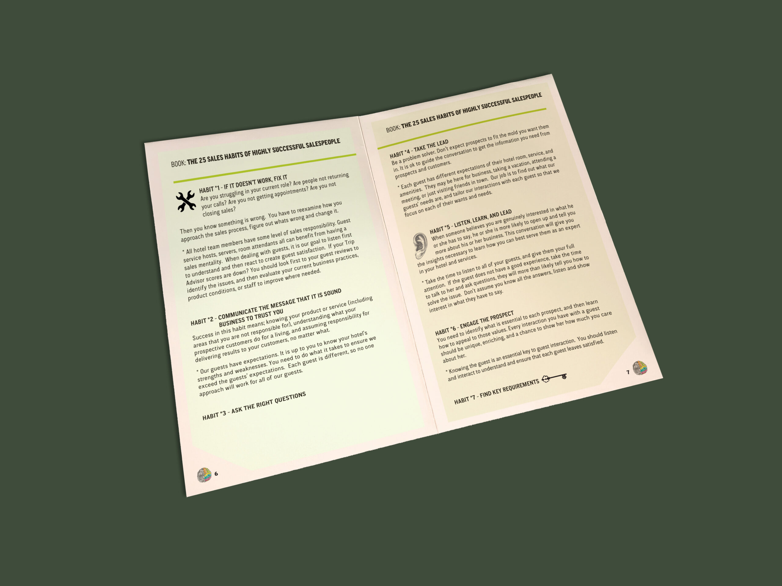
broughtonHOTELS | Pitch Book & Information Design

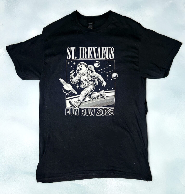
St. Irenaeus | Fun Run Apparel & Graphic Design

Leader 360 | Logo Design & Visual Process

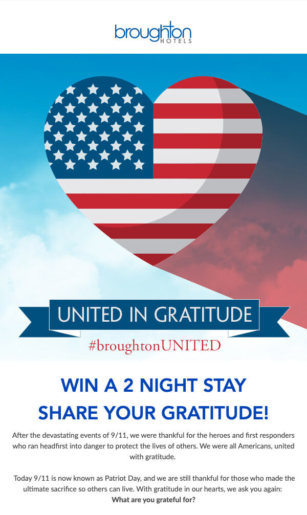
broughtonUNITED | Patriot Day Email & Social Campaign

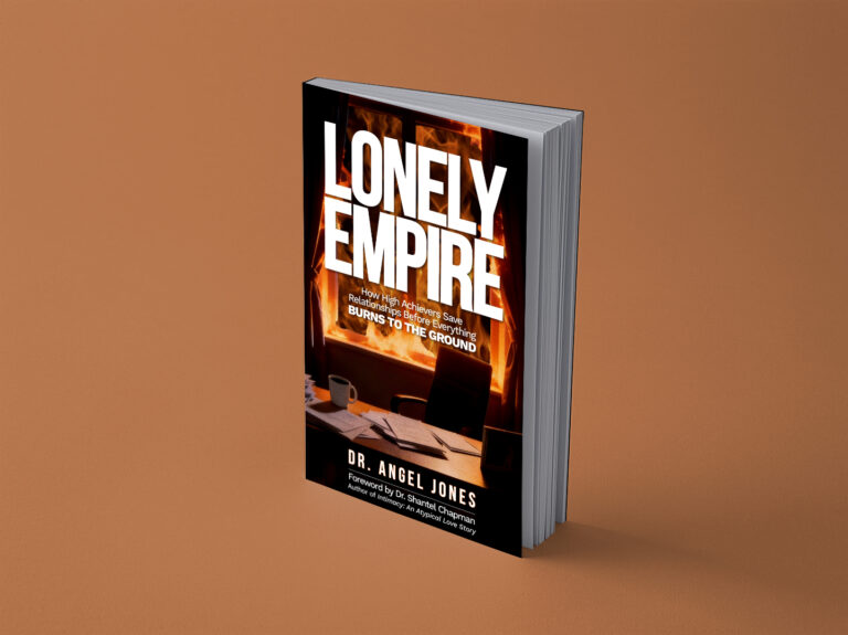
Dr. Angel Jones | Book Cover

Dr. Angel Jones | Logo Design & Visual Identity
Tagline:
Honoring the spirit of classic motels, reimagined with boutique hospitality design.
Summary:
Motique® is a founder-led brand platform that highlights a new category of hospitality: classic American motels renovated with the design and detail of a boutique hotel. I led the brand identity work including logo design, visual language, and layout direction to give Motique® a clean, editorial presence that honors the past while positioning it for modern travelers.
Impact Highlights:
Designed logo and full visual identity
Collaborated on property curation and layout styling
Defined content standards for future hotel features
Tagline:
Branded training kits that scaled across hotel teams.
Summary:
The Peak Potential Pack is a branded internal education program developed to train hotel staff across properties. I created the full visual system from print templates and digital quizzes, to sourcing production for custom-branded shipping boxes. The kits provided a consistent, self-guided learning experience for property teams.
Impact Highlights:
Designed print & digital training materials
Built quiz workflows using Google Forms
Managed production of all physical kit components
Tagline:
A full rebrand inspired by original artwork and lush garden surroundings.
Summary:
I led a complete identity refresh for Spanish Garden Inn, working closely with the hotel’s owner (a classically trained artist) and our VP of Marketing. Inspired by the property’s watercolor art and garden setting, I designed a new logo, clean typography system, and custom leaf motifs. The refreshed identity extended to all guest-facing materials: From emails, collateral and signage to a hand-painted logo at the property’s entrance, and was supported by an internal style guide.
Impact Highlights:
Replaced heavy, traditional aesthetic with a lighter, art-forward design
Designed full print suite: brochures, folders, stationery, signage
Delivered brand style guide for future consistency
Visual system received positive feedback from ownership and guests